SEO-friendly web design means building pages that search engines can crawl, index, and understand while giving visitors a fast, usable experience. Done right, it produces two outcomes: better discoverability in search results and a site people actually want to use. This guide walks through the technical and design decisions that get you there, step by step, without promising specific rankings.
TL;DR:
- Search engine indexing relies heavily on correct sitemap.xml, robots.txt, canonical tags, and HTTPS redirects, which are often overlooked during early development.
- Site structure, including descriptive URLs and internal linking with clear anchor text, influences both crawl efficiency and user navigation.
- Mobile-first design requires responsive layouts, touch-friendly elements, and proper image sizing to maintain rankings and user experience on mobile devices.
- Optimizing Core Web Vitals like load time, interactivity, and layout stability can significantly improve perceived performance and search visibility.
- Building with a flexible platform that allows control over URLs, metadata, and performance settings simplifies ongoing SEO maintenance and future updates.
Table of Contents
- What is SEO-friendly web design?
- Why SEO-friendly design matters for traffic and user experience
- Core technical foundations: indexability, HTTPS, and crawlability
- How site structure and URLs shape discovery
- Mobile-first and responsive design rules that protect rankings
- Performance and Core Web Vitals: what to fix first
- Writing titles, headings, and URLs that work for search and readers
- Getting images and video ready for search and speed
- Accessibility and semantic HTML: where WCAG and SEO overlap
- Structured data and eligibility for rich results
- Choosing a platform or CMS without boxing in your SEO
- A pre-launch checklist that catches SEO regressions early
- Ongoing monitoring and measurement after launch
- How Tradewinds United Media puts these principles into practice
- Let Tradewinds United Media build the SEO-friendly site for you
- Sources
- FAQ
What is SEO-friendly web design?
SEO-friendly web design is the practice of structuring, coding, and writing a website so that both search engines and people can find, read, and act on its content. It rests on a handful of pillars: indexability (can the page be added to a search index at all), crawlability (can automated systems reach and follow the page’s links), semantic HTML (does the markup describe what each piece of content actually is), and people-first content (does the page answer what a visitor came looking for).
These pillars work together rather than separately. A page with a fast load time but a broken heading structure confuses screen readers and search engines alike. A page stuffed with keywords but slow to load will frustrate visitors before they read a word. Google Search Essentials groups its requirements into technical basics, spam policies, and best practices, and treats all three as connected: a site that passes technical checks but ignores usability still underperforms.
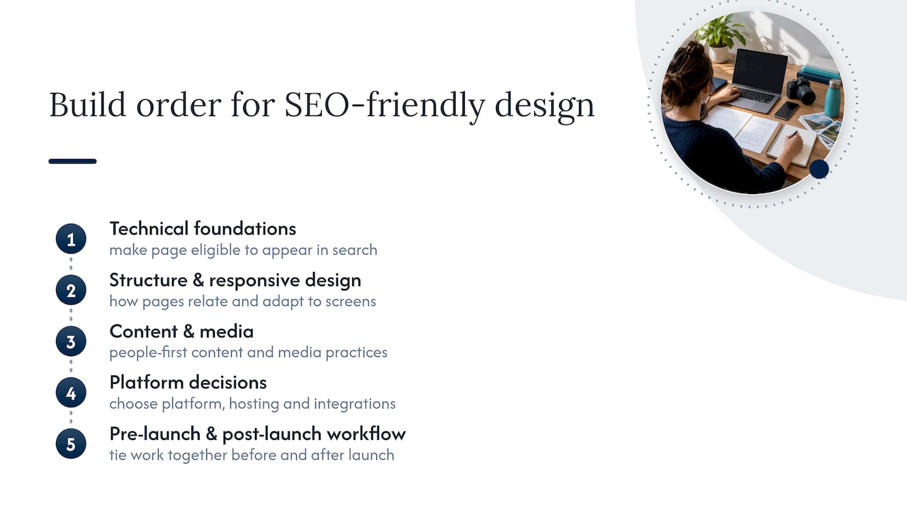
The rest of this guide maps to those pillars in build order. You will see technical foundations first (the requirements that make a page eligible to appear in search at all), then structure and design choices (how pages relate to each other and adapt to different screens), then content and media practices, then platform decisions, and finally the workflow that ties it together before and after launch. Each section builds on the one before it, the same way a real project moves from planning to code to a live, monitored site.
Why SEO-friendly design matters for traffic and user experience
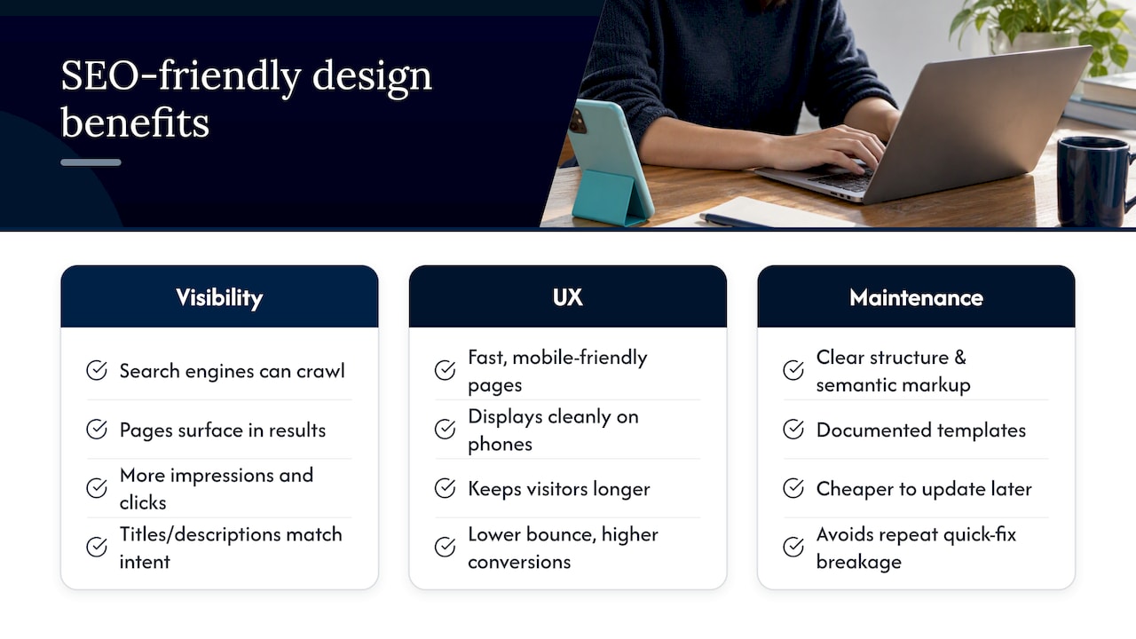
Search visibility and usability are not separate goals: they reinforce each other. A page that search engines can crawl and understand is more likely to surface in results for relevant queries, which means more impressions and, when the title and description match what searchers want, more clicks. Google’s own guidance frames the work this way: help search engines understand your content, and help users decide whether to visit, using the SEO starter guide as its baseline.
The user experience side compounds the effect. A page that loads quickly and displays cleanly on a phone keeps visitors around long enough to convert, while a slow or cluttered one sends them back to the results page. That bounce is a signal search engines and analytics tools both register, even if the mechanisms differ.
There is also a maintenance argument. Sites built with clear structure, semantic markup, and documented templates are cheaper to update later. A patchwork of quick fixes, by contrast, tends to break again the next time content or design changes, which is why treating SEO as an architectural decision rather than a launch-day checklist pays off over the life of the site.
Core technical foundations: indexability, HTTPS, and crawlability
Before a page can rank for anything, it has to be eligible to appear in search results at all. That eligibility depends on a set of technical basics that are easy to overlook once design work starts.
- Sitemap.xml lists the pages you want indexed and helps search engines discover new or updated content faster.
- Robots.txt tells crawlers which parts of the site to skip, but it should never be used to hide pages you actually want indexed.
- Canonical tags point to the preferred version of a page when duplicate or near-duplicate URLs exist, avoiding split signals across copies.
- Crawlable links use standard HTML anchor tags with real href attributes, not JavaScript-only click handlers that hide the destination from crawlers.
- HTTPS is a baseline requirement for both security and search eligibility, and redirect rules should map old URLs to their new equivalents with permanent redirects rather than leaving dead links behind.
Google’s Search Essentials documentation notes that meeting these technical requirements increases the likelihood of appearing in search, though it does not guarantee indexing or rank. It is also worth checking that critical content lives in the page’s actual HTML rather than being rendered only by heavy client-side JavaScript without server-side rendering, since Google’s guidance on AI-era search features stresses that crawlable, well-structured content remains the foundation even as new search features emerge. Before launch and periodically after, use Search Console’s URL Inspection tool to confirm that key pages are actually indexed and rendering as expected.
How site structure and URLs shape discovery
Search engines and visitors both rely on structure to understand how pages relate to each other. A flat pile of unconnected pages is harder to crawl efficiently and harder for a person to navigate, so information architecture deserves attention before a single template gets built.
- Use descriptive, directory-grouped URLs that reflect topic hierarchy, such as grouping service pages under a shared path rather than scattering them across the root.
- Build topic clusters around a central pillar page with supporting pages linked back to it, so related content reinforces itself instead of competing.
- Add internal links using descriptive anchor text that tells both readers and crawlers what the destination page covers.
- Include breadcrumbs on deeper pages so visitors always know where they are and can move up a level without hitting the back button.
- Label navigation items in plain language that matches how visitors actually describe what they are looking for, rather than internal jargon.
Structure also affects how often a search engine revisits a site. Pages that are well linked from the homepage or other high-traffic pages tend to get crawled more frequently than orphaned pages buried several clicks deep. A small business website with a clear service hierarchy and consistent internal linking gives both visitors and crawlers a predictable path through the content, which is exactly the kind of architecture Google’s starter guide recommends deciding on before development begins rather than retrofitting later.
Mobile-first and responsive design rules that protect rankings
Google indexes the mobile version of a page first, which means a design that only works well on a desktop monitor is a liability, not a nice-to-have gap. Mobile traffic also makes up a large and growing share of overall web visits, according to Statista, so mobile design is not a secondary consideration for most sites.
- Design for touch first, with tap targets large enough to hit accurately and enough spacing to avoid accidental taps on neighboring links.
- Keep important content visible on mobile rather than hiding it behind extra taps or collapsing it out of the initial view, since content hidden only on mobile can be treated differently than content shown on desktop.
- Use responsive images with srcset so the browser downloads an appropriately sized file for the device instead of a full desktop-resolution image on a small screen.
- Test on real devices in addition to browser emulators, since actual touch behavior and rendering quirks do not always show up in a simulated viewport.
Free tools like Lighthouse, built into Chrome’s developer tools, give a quick read on mobile usability issues such as text that is too small or elements placed too close together.
Performance and Core Web Vitals: what to fix first
Core Web Vitals measure the parts of page experience that visitors notice even if they cannot name them. Largest Contentful Paint (LCP) measures how long the biggest visible element takes to load. Interaction to Next Paint (INP) measures how responsive the page feels when someone clicks or taps. Cumulative Layout Shift (CLS) measures how much content jumps around while loading. Google recommends testing with both lab tools like Lighthouse and real-world field data, since the two can tell different stories about the same page, according to its guidance on AI and search fundamentals.
- Reduce render-blocking resources by deferring non-critical CSS and JavaScript so the page can paint sooner.
- Optimize font loading with font-display settings that show fallback text immediately instead of leaving a blank space.
- Lazy load offscreen images so the browser does not spend bandwidth on content the visitor has not scrolled to yet.
- Use a CDN and server-side caching to cut the physical distance and processing time between a request and a response.
Mobile devices account for a large and growing share of all web traffic, according to Statista, which means performance problems on a phone connection affect a substantial portion of visitors, not an edge case. Field data, gathered from real visitors through the Chrome User Experience Report, and lab data, generated by running a tool like Lighthouse against a single load, will not always agree. When they differ, field data reflects what your actual audience experiences, while lab data is better for isolating a specific fix during development.
Writing titles, headings, and URLs that work for search and readers
Content placement and phrasing carry as much SEO weight as any technical setting. Google’s guidance is consistent on this point: place the words searchers actually use in titles, headings, and the first few lines of a page, and write for people first, according to the SEO starter guide.
- Write a unique title tag and H1 for every page that describes the page’s specific topic rather than a generic label reused across the site.
- Keep URLs short and descriptive, using words rather than internal IDs or unrelated parameters.
- Write meta descriptions that summarize the page’s value in a sentence or two, since a strong description can influence whether someone clicks even though it is not a ranking factor itself.
- Use heading tags in order (H1, then H2, then H3) to reflect the actual outline of the content instead of picking heading sizes for visual effect.
- Link internally with descriptive anchor text that names the destination topic instead of generic phrases like “click here.”
A practical content template for a marketing page includes one clear H1 matching the page’s purpose, a short introductory paragraph that states the value up front, H2 sections addressing the questions a visitor would ask next, and internal links to related services or resources. This structure serves the reader first, which is also what search engines are built to reward.
Getting images and video ready for search and speed
Media files are often the heaviest part of a page, and they carry SEO signals that plain text does not.
- Name image files descriptively (
blue-widget-installation.jpgrather thanIMG4821.jpg) so both search engines and asset management tools understand what the file shows. - Write alt text that describes the image’s content and function, which helps screen reader users and gives search engines context when an image cannot be parsed visually.
- Use modern formats like WebP or AVIF where supported, since they typically produce smaller file sizes than JPEG or PNG at comparable quality.
- Serve responsive images so mobile visitors are not downloading a desktop-sized file.
- Lazy load images below the fold, but avoid lazy loading the single most important image visible on page load, since that can delay LCP.
- Provide transcripts or captions for video, which make the content accessible and give search engines text to index that a video file alone cannot offer.
Accessibility and semantic HTML: where WCAG and SEO overlap
Accessibility work and SEO work share more overlap than most teams expect, because both depend on markup that clearly describes what content is and how it functions. The Web Content Accessibility Guidelines (WCAG) 2.2 organize requirements around four principles: content should be perceivable, operable, understandable, and robust.
- Use semantic heading tags and labeled form controls so assistive technology and search crawlers can both parse the page’s structure correctly.
- Provide text alternatives for non-text content, including images, icons, and embedded media.
- Check color contrast ratios between text and its background to confirm they meet WCAG’s minimum thresholds.
- Test keyboard navigation by tabbing through the entire page without a mouse to confirm focus order makes sense and nothing is unreachable.
Fixing accessibility defects frequently surfaces SEO and usability problems at the same time, since both often trace back to unclear or missing semantic markup. Tools like WAVE or the axe browser extension catch many issues automatically, but a short manual pass, tabbing through a page and checking heading order, remains the most reliable way to confirm the page actually behaves as intended.
Pro Tip: Run an automated accessibility scan early in development, then do one manual keyboard-only pass before launch, since automated tools miss context-dependent issues like illogical tab order.
Structured data and eligibility for rich results
Structured data, written as schema markup, gives search engines explicit labels for specific pieces of content, such as marking a page as an Article, a set of questions as an FAQ, or a navigation trail as a BreadcrumbList. Adding it increases eligibility for enhanced search result features, but it does not directly improve ranking and never guarantees a rich result will actually display.
Common schema types worth adding where relevant include Article markup for blog content, FAQPage for question-and-answer sections, BreadcrumbList for navigation trails, and LocalBusiness for pages tied to a physical location or service area. After adding markup, validate it with Google’s Rich Results Test and monitor the Enhancements reports in Search Console for errors. Treat structured data as a way to add clarity for machines reading your content, not as a shortcut around the content and technical work covered earlier in this guide.
Choosing a platform or CMS without boxing in your SEO
Platform choice determines how much control you actually have over the technical foundations covered above. Some decisions matter more than they seem to at setup time.
- URL and redirect control: confirm the platform lets you set custom URL patterns and add permanent redirects without a developer for every change.
- Template-level metadata: check whether you can edit title tags, meta descriptions, and heading structure on a per-page basis, not just site-wide.
- Access to structured data: some platforms add schema automatically, others require a plugin or custom code, and the difference affects how much markup you can realistically maintain.
- Performance tuning options: verify you can control caching, image compression, and script loading rather than accepting whatever the platform ships by default.
Managed website builders can be a reasonable choice for straightforward sites with limited page counts, since they bundle mobile responsiveness and basic structured data tools out of the box. Self-hosted platforms with a plugin ecosystem or custom code generally offer more control over the details above, at the cost of more setup and maintenance work. When evaluating a vendor or agency, ask directly how much control you retain over URLs, metadata, and performance settings once the project ships.
A pre-launch checklist that catches SEO regressions early
Treating SEO as an architectural requirement means deciding on structure before development starts, not patching it in afterward, a sequence Google’s starter guide frames as the difference between a stable launch and a costly cleanup.
- Research: confirm target topics, competitor content gaps, and the terms your audience actually searches.
- Information architecture: map the full site hierarchy, URL patterns, and internal linking plan before any template gets built.
- Templates: design page layouts with metadata fields, heading structure, and image placeholders built in from the start.
- Development: build with semantic HTML, crawlable navigation, and responsive layouts as default requirements, not later additions.
- Crawl and indexability QA: verify sitemap.xml, robots.txt, canonical tags, and redirect rules on staging before launch.
- Performance testing: run Lighthouse and PageSpeed Insights against key templates and fix major issues before go-live.
- Launch: push to production, then request re-crawling of key pages through Search Console.
Pro Tip: Keep a rollback plan ready on launch day, including the previous sitemap and redirect map, so a broken deployment can be reversed in minutes rather than hours.
Verify on staging with a noindex tag removed only at the moment of launch, never before, to avoid accidentally letting search engines index an unfinished site.
Ongoing monitoring and measurement after launch
Launch is the start of the work, not the end of it. A minimal monitoring stack covers four areas: Google Search Console for indexing status and search performance, field Core Web Vitals data for real-user experience, an analytics platform for traffic and conversion behavior, and uptime or sitemap monitoring to catch outages or crawl errors quickly.
- Watch indexing coverage in Search Console for sudden drops, which often signal a technical problem like an accidental noindex tag or blocked resource.
- Track Core Web Vitals trends rather than single snapshots, since a one-time dip can be noise while a sustained decline points to a real regression.
- Separate technical drops from content or external causes by checking whether the issue is site-wide (likely technical) or limited to specific pages (more likely content or competitive).
- Set a reporting cadence, whether weekly or monthly, tied to specific goals like organic sessions or form submissions rather than vanity metrics alone.
How Tradewinds United Media puts these principles into practice
Applying this checklist on a real project means walking a local business through the same sequence: research and architecture first, then templates that bake in metadata and heading structure, then development with crawlable navigation and semantic HTML, then QA before anything goes live. That order avoids the common failure mode of designing first and trying to retrofit SEO afterward.
Tradewinds United Media builds its website design and SEO services around this sequence for small business clients, pairing technical setup with the reporting clients need to see what changed and why.
If you are mapping out a site build or a redesign and want a second opinion on the plan before development starts, that kind of practical audit is often the highest-value step to take early.
— Michael
Let Tradewinds United Media build the SEO-friendly site for you
If you would rather hand off the technical work than manage a build sequence yourself, Tradewinds United Media’s Website Design service covers the architecture, templates, and technical foundations outlined in this guide, and the SEO service picks up where design ends, handling ongoing on-page work, monitoring, and the reporting that shows what changed month to month.

Clients receive a site built with crawlable structure and mobile-first templates from day one, along with performance reports to track progress. If your current site was built without SEO in mind, or you want a plan before starting from scratch, request a local SEO report to see where the gaps are before committing to a full redesign.
Sources
- Google Search Essentials (formerly Webmaster Guidelines) | Google Search Central
- Statista: share of website traffic coming from mobile devices
FAQ
What kind of website is best for SEO?
The best website for SEO is one built with crawlable HTML, clear site structure, fast load times, and mobile-first responsive design from the start. No single platform guarantees good SEO on its own: the technical setup, content quality, and ongoing maintenance matter more than the tool used to build it.
What is an SEO-friendly site structure?
An SEO-friendly site structure organizes pages into logical groups with descriptive URLs, connects related content through internal links, and keeps important pages within a few clicks of the homepage. This helps search engines crawl efficiently and helps visitors find related content without confusion.
How does mobile-first design affect SEO?
Search engines index the mobile version of a page first, so a site that hides content, breaks layouts, or loads slowly on a phone can be at a disadvantage in search results. With a large and growing share of overall web traffic coming from mobile devices, according to Statista, responsive design has become a baseline requirement rather than an optional upgrade.
Does structured data improve search rankings?
Structured data does not directly improve rankings, but it increases a page’s eligibility for enhanced search result features like rich snippets. It works best alongside solid technical SEO and content quality, not as a replacement for either.
Should I choose WordPress or a hosted website builder for SEO?
The right choice depends on how much control you need over URLs, redirects, page-level metadata, and performance settings, since self-hosted platforms with plugin access typically offer more of that control than fully managed builders. Managed builders can still work well for simpler sites that need built-in mobile responsiveness without ongoing technical maintenance.