Yes, trust signals reliably raise visitor confidence and lift conversions. If you fix nothing else this week, do three things: surface verified reviews with real names, add a specific money-back guarantee near your buy button, and make your security, payment, and contact details visible above the fold. Put one trust line next to your primary call-to-action before you touch anything else.
TL;DR:
- Verified reviews with actual counts have a greater impact than ratings alone and should be placed near primary calls-to-action.
- Testimonials with photos and specific outcomes are more memorable and persuasive than anonymous or vague praise.
- Trust signals must be visible above the fold close to the decision point, especially at checkout, to prevent abandonment due to security concerns.
- Focus on a few highly credible signals, such as real reviews and explicit guarantees, rather than overcrowding pages with numerous weak badges.
- Regularly audit and update trust signals to ensure they address real objections, are current, and are implemented efficiently without slowing page load times.
Table of Contents
- What Trust Signals on a Website Actually Do
- The Highest-Impact Trust Signals to Add First
- Where on the Page Trust Signals Actually Belong
- Collecting and Writing Social Proof That Actually Persuades
- Technical Trust Signals and Why Implementation Speed Matters
- How to Audit Your Trust Signals in One Afternoon
- What Small Businesses Get Wrong About Trust Signals
- Get Professional Help Implementing Trust Signals That Convert
- Sources
What Trust Signals on a Website Actually Do
A trust signal is any visible cue that tells a visitor “this business is real, competent, and safe to buy from.” They fall into three buckets: on-site social proof (reviews, testimonials, star ratings), off-site signals (press mentions, third-party review platforms, backlinks from known sources), and technical signals (HTTPS, payment logos, a working privacy policy link).
The psychology behind this is well documented. People facing uncertainty default to copying what others have done, which is why social proof functions as one of the most influential trust drivers online. Stanford’s credibility research backs this up from a different angle: visitors scan for concrete, checkable evidence, like visible contact information and clear policies, not vague claims of quality.
For local businesses, the effect shows up in a very specific number. Shoppers actively check online reviews before choosing a local business far more often than most owners assume, which means a thin or outdated review profile is doing quiet damage every day it sits unaddressed.
- On-site: reviews, testimonials, guarantees, star ratings
- Off-site: press coverage, third-party review sites, Google Business Profile
- Technical: HTTPS, payment icons, visible privacy policy and contact page
The Highest-Impact Trust Signals to Add First
Not every trust signal pulls equal weight. Some move the needle on their own; others just fill space. Here’s the order to work through, based on what actually influences a buying decision versus what just looks nice in a template.
- Verified reviews with counts. A rating next to a number (“4.8 from 212 reviews”) beats a rating alone every time. Counts signal volume, and volume signals that the reviews are real, not cherry-picked.
- Testimonials with photos and named outcomes. A face attached to a quote sticks in memory far longer than plain text. Testimonials paired with a photo and a specific result produce noticeably higher recall than anonymous claims.
- A specific guarantee. “30-day money-back, no questions asked” removes far more hesitation than a generic “secure checkout” badge, because it answers a concrete fear instead of gesturing at safety.
- No credit card required trials or samples. Removing the payment step from a trial signup tells a visitor you’re confident enough in the product to let them test it risk-free.
- Client logos and press mentions. These work best when the names are recognizable. A row of unknown logos does nothing; four or five familiar ones do a lot.
- Case studies with real metrics. “Increased local leads by tracking calls and form fills” beats “we helped grow their business” because it’s falsifiable, which makes it credible.
- Payment icons, returns policy, and shipping speed near the buy box. For ecommerce specifically, these three sit right where the last-second doubt happens.
Pro Tip: Rank your existing trust signals by how directly they answer a real objection a buyer has, not by how impressive they look. A logo wall is decoration. A guarantee that names the exact refund window is persuasion.
Where on the Page Trust Signals Actually Belong
Placement matters as much as content. A five-star badge buried in the footer does almost nothing, because the visitor has already decided by the time they scroll that far.
- Put at least one trust element within eye-line of every primary call-to-action, not just somewhere on the page.
- Reinforce trust again at cart and checkout. This is where hesitation peaks, and Baymard’s checkout research links a meaningful share of cart abandonment directly to payment security concerns, which means a lone security badge near the “Pay Now” button often earns its space more than three others combined.
- A thin sticky header or trust strip (“Free returns · Secure checkout · 4.9 stars”) can work, but only if it’s understated. Loud, animated, or oversized strips read as trying too hard.
- Never rely on footer-only placement. If a signal only appears where 90% of visitors never scroll, it isn’t doing its job.
- Avoid badge walls. Piling on ten trust icons at once has the opposite effect of what you’d expect. When you’re stacking payment or client logos, limiting the group to four or six recognizable names beats a crowded row of a dozen weak ones, because volume without recognizability just reads as compensating for a lack of real proof.
The rule that ties it together: trust signals work in proximity to the decision, not in proximity to each other.
Collecting and Writing Social Proof That Actually Persuades
Generic reviews do less work than reviews aimed at a specific doubt. If a visitor’s biggest hesitation is price, you need a testimonial that addresses value for money directly, not a vague “great service!” Every piece of social proof performs better when it’s written to knock down one specific objection rather than serving as a general pat on the back.

Timing matters for collection too. Ask right after a win, delivery, or resolved support ticket, when the experience is fresh. A simple prompt like “What result surprised you most?” tends to pull better answers than “Leave us a review.”
Format each testimonial the same way for consistency:
- Full name, and a real photo whenever the customer agrees to share one
- Job title or location, for extra specificity
- A concrete outcome or number, not a vague compliment
- A “verified purchase” or “verified customer” tag where your platform supports it
Save full case studies for B2B or higher-ticket decisions where a buyer wants the full story. Short quotes work better on landing pages where attention is limited. Test both formats against each other on your highest-traffic page and watch conversion rate, not just clicks.
Pro Tip: Run one testimonial with a photo against one without, on the same page, for two weeks. The gap in performance usually settles the debate faster than any opinion in a meeting.
Technical Trust Signals and Why Implementation Speed Matters
The basics still matter: HTTPS with a visible padlock, a real privacy policy linked in the footer and at checkout, and payment logos exactly where the card form appears. Skip any of these and visitors notice, even if they can’t articulate why the page feels off.
- Never fake a compliance badge. Only display SOC 2, HIPAA, or PCI marks if you’ve actually completed that certification.
- Keep the privacy policy link visible, not buried three clicks deep.
- Show payment icons at the point of payment, not scattered randomly across the homepage.
Here’s the part most site owners get wrong: how you implement these signals matters almost as much as whether you have them. Heavy JavaScript-based badge plugins can quietly wreck load times. Native theme code or inline SVGs deliver the same visual trust cue without the page-speed cost that badge apps often introduce, and a slow page undermines every trust signal sitting on it.
How to Audit Your Trust Signals in One Afternoon
Start with a gut check before you touch any code.
- Run a 30-second first-impression test. Show the homepage to five people who’ve never seen it and ask if they’d trust it with their credit card.
- Check CTA proximity. Stand next to every primary button. Is there a review, guarantee, or security cue within arm’s reach, visually?
- Verify your testimonials are real. Confirm names, photos, and outcomes are attributable and current, not leftover placeholder content from a template.
- Track the right metrics. Watch review volume, conversion rate by page, cart abandonment rate, and micro-conversions like email signups or added-to-cart events.
- Run a real test. Add your top three prioritized signals, then compare micro-conversions before and after over a two-week window.
| Signal added | What to measure | Warning sign |
|---|---|---|
| Reviews near CTA | Conversion rate by page | Reviews look generic or unverifiable |
| Guarantee near buy box | Cart abandonment rate | Guarantee wording is vague |
| Payment icons at checkout | Checkout completion rate | Icons slow page load |
What Small Businesses Get Wrong About Trust Signals
Most small business owners treat trust signals as decoration they add once and forget. That’s backwards. The businesses that actually see conversion lifts treat trust signals as a living part of the page that gets audited and rewritten as often as the copy does.
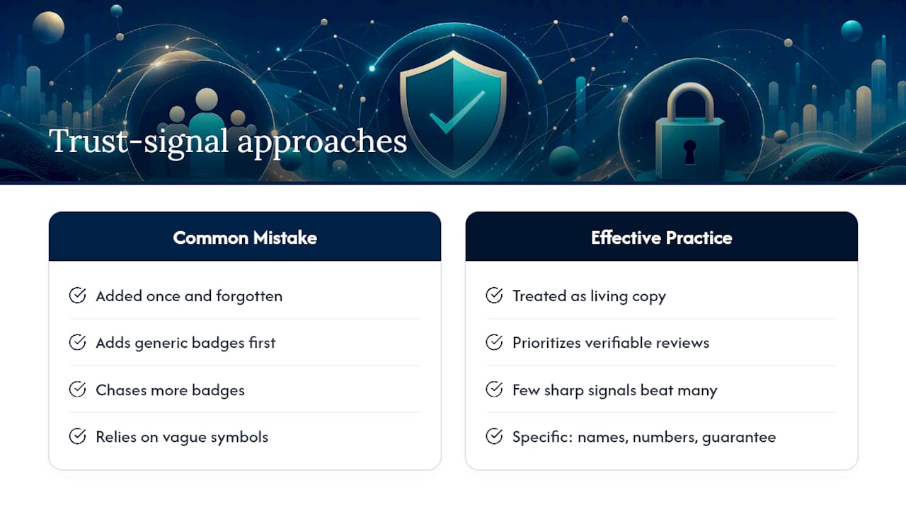
The bigger mistake I see constantly: owners chase badges before they chase reviews. A “secure checkout” icon is worth far less than ten specific, verifiable customer reviews, yet it’s the first thing most people add because it feels like a quick win. Given how much reported online scam activity has shaped buyer wariness in recent years, visitors have gotten sharper at spotting hollow trust theater. A generic badge doesn’t fool anyone anymore. What earns trust now is specificity: named customers, real numbers, and a guarantee you’d actually honor if someone called you on it.
If there’s one thing worth arguing with the conventional wisdom on, it’s this: more signals is not the same as more trust. A page with three sharp, verifiable signals placed correctly will outperform a page with twelve mediocre ones every time, because visitors aren’t counting badges. They’re looking for the one piece of proof that answers their specific doubt.
— Michael
Get Professional Help Implementing Trust Signals That Convert
Reading a checklist is one thing. Rebuilding a site’s structure, review pipeline, and checkout flow around it is another. Tradewindsunitedmedia handles the parts that take the most time and the most technical care: professional website design built to place trust cues exactly where Baymard’s checkout research says they matter, without the page-speed cost of bloated badge plugins.

The reputation management and local SEO side handles the harder problem: getting a steady stream of real, verified reviews instead of a stagnant profile from three years ago. A typical engagement starts with an audit of your current signals, moves into a prioritized fix list, and ends with a measurement plan so you can see the actual lift in conversions, not just a redesigned homepage that looks nicer. If your site is losing visitors at the exact moment they should be convinced, get a local SEO report and see where the trust gaps actually are before you spend another dollar guessing.
Sources
- Trust Signals for Websites: The Complete Guide | TeardownHQ
- The Importance of Social Proof as a Trust Signal – Wharton
- How Do People Evaluate a Web Site’s Credibility? — Stanford
- Fudge
- Social proof importance and evidence — CXL